Theme settings
Inspire offers numerous settings that allow you to set up the theme entirely to your liking. Especially when you are setting up the theme for the first time, it is important to go through all these settings. This largely determines what your webshop will look like. Here you will find information about adjusting the general theme settings of Inspire.
- In the Shopify Admin, go to Online Store > Themes
- Click the 'Customize' button under 'Inspire'
- Click the gear icon at the top to open the theme settings.
The theme settings are divided into different sections. Below, all sections and their corresponding settings are explained.
Logo
Here you can upload your logo. These logos are used in multiple places, including the header.
- Logo: Upload your logo here. SVG or PNG (transparent) is recommended.
- Logo width: Choose how wide (in pixels) you want your logo to be displayed in the header, among other places.
- Favicon: Upload your desired favicon here (the small icon in your browser's tab).
Colors
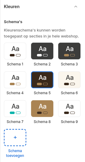
Here you can determine which colors you want to use in your theme. Inspire works with "Color schemes". You define the colors you want to use in one place, after which you can reuse these color schemes across all pages and sections. This prevents you from having to enter your colors separately in every section, while still giving you complete freedom.
Setting up color schemes
For more information on using color schemes, we refer you to the Shopify documentation: https://help.shopify.com/en/manual/online-store/themes/customizing-themes/theme-editor/theme-settings#colors
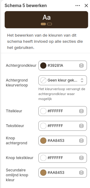
Other color settings
There are a number of color settings we use as a fallback if a color scheme is not available, or for specific notifications. Choose colors that best fit your brand and are easily readable on all types of screens and devices:
- Body & Bg color: The general text and background color of the page.
- Link color: The default color for clickable links.
- Border color: The default color for divider lines and borders.
- Status colors (Danger, Warning, Success, Info): Colors used for specific notifications such as errors (red), warnings (yellow/orange), success messages (green), and informational messages (blue).
Typography
In this section, you manage the fonts, font sizes, and alignment for your entire webshop.
- Fonts: Choose the font for your Headings (Heading font) and your Regular text (Body font) here.
- Font sizes Desktop & Mobile: For each type of text (H1 to H6, Display 1 & 2, and the default text), you can set exactly how large it should be in pixels. You can set this separately for desktop and mobile screens, ensuring your webshop is always perfectly readable.
- Spacing and Line height: Determine the space between individual letters (Letter spacing) and the height of the lines (Line height) for both headings and body text.
Layout & Styling
Here you determine the general design, widths, and rounded corners of your webshop.
- Container width: Determine the maximum width of the content on large screens (adjustable from 1100px to 1800px).
- Border Radius: You can round the corners of various elements to give the webshop a softer or sleeker look:
- Sections: Determine the rounding and choose whether this should be applied to the top, bottom, or both sides.
- Cards: Determine the rounding for product and information cards.
- Buttons: Make buttons squared, slightly rounded, or fully pill-shaped.
- Card Shadow: Add a shadow to cards. Choose whether you want to show it always, never, or only when you hover over it with the mouse (hover).
- Entrance Animations: Enable whether elements should appear with a smooth animation as soon as you scroll down.
Header
Specific settings for the top of your website (the navigation bar).
- Transparent header: Check this box if you want the header to fall transparently over the first section (such as a large hero image).
- Text color & Logo transparent header: If the transparent header is enabled, you can set a different text color and a special (e.g., white) logo here so that it remains easily readable on a dark background image.
Sections
Manage the default whitespace (spacing) in your webshop here to ensure a calm, well-organized layout.
- Spacing on Desktop: Set the distance inside sections (padding) and the distance between different sections (margin).
- Spacing on Mobile: Set the same type of spacing specifically for mobile views, as you often want to use less whitespace there.
- Custom spacing Homepage: There are separate settings to fine-tune the distances between sections specifically for the homepage (both for desktop and mobile).
Product Cards
Here you manage the display of products in overviews (such as collection pages and product sliders).
Design & Content
- Color scheme & Border: Choose which color scheme applies to product cards by default and whether they should have a border.
- Text alignment: Align the text in the card to the left, center, or right.
- Show information: Check whether you want to display the brand/vendor, the title, the price, and the currency indicator.
Buttons & Actions
- Button Type: Choose what the main button on the product card does: Show no button, 'View product', or directly 'Add to cart'. You can also set the label and an optional icon for the view button.
- Quantities & Variants: Determine whether customers can directly choose a quantity (number input). You can also set whether and how product variants (such as color or size) should be displayed or filtered directly on the card (always, never, or only on mobile).
Images & Display
- Image Ratio: Choose the format of the product images (e.g., 1:1 square, 3:4 portrait, 16:9 landscape).
- Image Fit: Choose whether the image should be cropped or fully fit with possible whitespace (pad).
- Hover Effects: Enable whether the image should zoom in on hover, whether an alternative image should be shown (hover effect), and whether the shopping cart button only becomes visible on hover.
Typography on the card
- Determine exactly the font size (H1 to H6 or body) and font weight (normal or bold) for both the product title and the price.
- Title display: Choose whether the title is forced onto one line or two lines, and whether long titles should be truncated or shown in full.
Badges (Labels)
- Design: Choose whether the labels should have straight or rounded corners.
- 'New' Badge: Enable to automatically give a label to recently added products. Set the number of days a product is considered 'new' and customize the colors, text, and icons.
- 'Sale' Badge: Enable for discounted items. Choose whether you want to show text (e.g., "Sale") or a percentage (e.g., "-20%").
- Custom Badge: Set custom labels via Shopify Metafields and determine the colors and icon.
Collection & Brand Cards
Settings for displaying collections or brands in grid overviews.
- Display: Choose whether the name of the collection and a border around the card should be shown.
- Images: Just like with product cards, you can set the ratio (1:1, 3:4, etc.) and the fit (crop/pad) here.
- Hover: Enable the zoom-in effect when a visitor hovers over the collection card with the mouse.
Hero Cards
Specific cards that are often used at the top of pages or as large featured blocks.
- Title alignment: Determine where the title is placed in the hero card (for example, tightly aligned at the bottom via 'flex-end' or distributed via 'space-between').
- Design: Choose whether these cards should have a border and whether the image should zoom in on hover.
Article Cards
Settings for displaying blog articles in overviews.
- Title & Text: Determine whether the blog title should be truncated after 2 lines or shown in full. Also choose whether a short summary (excerpt) of the article should be shown on the card.
- Images: Choose the ratio of the blog images (default 4:3) and whether they should be cropped or made to fit (pad).
Social Media
Add the links (URLs) to your social media profiles here. If you enter a link, the corresponding icon will automatically appear in the places in the theme where social media icons are shown (such as in the footer).
Supported platforms:
- X (formerly Twitter)
- TikTok
- Snapchat
- YouTube